
In this essay, I will explore a brief history of music engraving, from traditional plate engraving to modern computer-based engraving, and some important qualities that make sheet music more legible, musical and beautiful.
What is Music Engraving?
Plate Music Engraving (traditional)
The term music engraving derives mainly from the traditional process of high quality music printing method called plate engraving. This traditional method, which had been in use from the sixteenth century, reached to its peak in the first half of the twentieth century. However, it was on the decline in the second half of the twentieth century (partly because of the spread of photocopiers) and eventually became obsolete by 20001 and was replaced by computer music engraving.
The elegant and beautiful end result was only achieved by highly skilled and experienced professionals of the plate engraving who had completed around nine years of apprenticeship.
From distribution of space between notes, stem directions, stem lengths, beam angles, line widths for both staves (staffs) and ledger lines, bar (measure) widths, line breaks to slur curvature, vertical and horizontal placement of dynamics and the ways to avoid collision in a complex voicing, were adjusted depending on the musical context by the hand of skilled engravers who comprehended music. Criteria for engraving legible and beautiful sheet music varied between publishing houses. Those distinctive house styles and traditional music layout convention are valuable historical reference points for modern music engravers and musicians who use computer music notation software.
{"preview_thumbnail":"/kazu-suwa-guitar/sites/default/files/styles/video_embed_wysiwyg_preview/public/video_thumbnails/BvyoKdW-Big.jpg?itok=8tngmX8t","video_url":"https://www.youtube.com/watch?v=BvyoKdW-Big","settings":{"responsive":1,"width":"854","height":"480","autoplay":1},"settings_summary":["Embedded Video (Responsive, autoplaying)."]}
Computer Music Engraving
When personal computers started to reach masses from the eighties, reputable music publishers also started opting for replacing time-consuming (but high-quality) plate music engraving method with computer-based music engraving using proprietary music notation software such as SCORE or Amadeus. Both SCORE and Amadeus were renowned for their outstanding output, which was on par with the results obtained by traditional plate engraving. It is well known that Amadeus was the first computer-based engraving program chosen by Henle Verlag.
However, none of them flourished. Those software required skilled music engravers who were also capable of controlling the position of all the music items by typing numerical parameters on the computer. In addition, the operating systems which those programs were designed and ported for also became obsolete (SCORE ran on MS-DOS while Amadeus ran on PDP-11 and Atari ST).
Music notation software has come a long way in the last three decades. Commercial software with intuitive and attractive graphical user interface such as Finale, Sibelius, and Dorico are capable of delivering good looking sheet music out of the box, and it goes without saying that almost anything can be achieved if an engraver or a user knows how to manually adjust sheet music for a better result. It seems that Finale and Sibelius are considered industry standard with Dorico catching them up.


It is worth mentioning that there are also very capable music notation software such as Lilypond and MuseScore which can be downloaded free of charge from their websites.
Lilypond's philosophy is to produce high-quality sheet music through its typesetting algorithm that follows traditional engraving layout convention. According to their website, Lilypond is inspired by the aesthetic of European music publishers in the first half of the twentieth century, including Bärenreiter, Duhem, Éditions Durand, Friedrich Hofmeister Musikverlag, Edition Peters, and Schott. Once a user has inputted music notes by typing on a simple text file, the software takes care of the layout, automatically generating an admirable sheet music.

MuseScore offers very intuitive graphical interface similar to Finale or Sibelius. Sheet music generated by MuseScore resembles a little bit the output of Lilypond, because MuseScore uses the same Feta music font developed by Lilypond. However, it has different layout algorithm.
What makes sheet music more legible?
Being the medium of communication between a composer / composition and a player, the ultimate goal of sheet music is to pass its musical information as efficiently as possible to the player. Firstly, each composer's unique musical language should be translated into a standardized musical expression (convention) so that any player can easily understand the musical content. Secondly, visual flow of the sheet music should naturally match with the musical content in order to minimize distractions.
Below are a few examples of accumulated knowledge that traditional plate engravers used to implement in order to increase legibility.
Music Font

Font Weight
The weight of music font has huge impact on legibility of sheet music, especially, when it is viewed from a distance.
Ex. 1 is an excerpt of Sonata in C major Op.15 by Mauro Giuliani showing two different printed results. The first version with heavier music font is much more legible.
Ex. 2 is an excerpt of Study No.16 (Book 2), Op. 35 by Fernando Sor, showing two different versions of printed sheet music. Again, the first version has heavier note heads and considerably heavier dot. Clearly, the dot of the second version is too light and less legible.
Stave (Staff) Line, Ledger Line, Bar Line, and Stem Thickness
Together with font weight, the thickness of the stave (staff) lines, ledger lines, and bar lines is another key factor to make sheet music more legible in order for musicians to be able to read comfortably from a certain distance, for example, between a music stand and a player.
The first version (top) of Ex. 1 and Ex. 2 is easier to read because of the following reasons:
- Stave (Staff) lines are reasonably thick and the weight of note heads and line thickness are well balanced
- Bar lines are clearly thicker than stave (staff) lines
- Ledger lines are clearly thicker than stave (staff) lines (also see Ex. 2a and Ex. 2b)
- Stem is suitably thick
Good contrast of line thickness between the elements gives greater clarity.
Stem Length
Both Ex. 1 and Ex. 2 exemplify how disproportionate stem length can affect legibility.
Accidental Symbols

Weight and placement of accidental symbols also influence legibility. Both Ex. 2a and Ex. 2b are close-ups of accidental symbols of Ex. 2. Accidental symbols of the first version are slightly heavier and vertically larger, considerably increasing legibility.

Accidental symbols should be placed close enough to note heads to keep the visual flow. However, when more than two ledger lines are involved, it becomes increasingly overcrowded. Traditionally, shorter ledger lines were used to avoid this problem (see Ex. 2b).
Spacing

Optimizing the use of space is crucial because it not only affects legibility, but also player's subsequent performance.
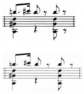
Ex. 3 shows two different engraving results of a fragment of Nocturno by Federico Moreno-Torroba. The first thing that catches our eye is the difference in bar (measure) width, the first one (top) being more compact, while the second one (bottom) being wider because notes are more spaced. The first version (top) used only a necessary amount of space to express the musical idea without loosing clarity. Saving space, or not wasting space, is one of the key factors to improve legibility because it saves players from unnecessary eye movements and page-turning.
It is also important to note that the optimum spacing can vary depending on various factors, including the length of a composition, page size, format, etc..

Note spacing should reflect note values. For example, Ex. 3a, a close-up of the second result of Ex. 3, shows that the semiquaver (sixteenth) rest and notes are evenly distributed in a space of one beat, correctly reflecting note values. However, if you look the second version of Ex. 3 again, you will probably have the impression that between the first semiquaver (sixteenth) rest and the following note E is more spaced than between the next three consecutive semiquaver (sixteenth) notes. This is because our eyes are very easy to be tricked by seeing different spaces: the space between the rest and the second note, the space between the note heads, and the space between the consecutive stems. Because of this, note spacing of the first version of Ex. 3 was adjusted by narrowing the spacing accordingly in order to compensate for this optical illusion. Because of this optical compensation, a player will get the musical idea, in this case, the semiquaver (sixteenth) rhythm, more effortlessly, without visually disrupting the flow of music.

Another typical spacing adjustment is the spacing between the last note that meets a certain condition and the bar line. Ex. 3b is a close-up of Ex. 3 (end part). The second version , which has no compensation, the last note E's stem and the bar line are quite close to each other. Together with the fact that the thickness of the stem and bar line is similar, this can decrease legibility. On the other hand, the first version (top) is manually compensated by giving a slightly larger space for a better legibility.
This compensation will not be applied if the last note is not beamed or the pitch of the last up-stemmed note is high enough (the stem will no longer confuse our eye) or the last short-value note has down stem (the stem is on the left side of the note head).

In the same way, a suitable spacing between the clef and the first note of the bar (measure) will increase legibility. Ex. 4 is an excerpt of Study No. 3, Op. 35 by Fernando Sor, showing two versions of printed sheet music. Because of the acciaccatura, the second version without compensation looks overcrowded.
Beam Angle

Though some people and notation software might always prefer flatten beams, beam angle also plays very important role in improving legibility. Ex. 5 is a comparison of two engraved results, the first one with flatten beams and the second one with manually adjusted beams. As you can see, the second version visually conveys the musical idea of the Alberti bass much better. Beam angle also affects stem length of each note. This is the reason that the second version looks much neater.